Simplified New Navigation Experience
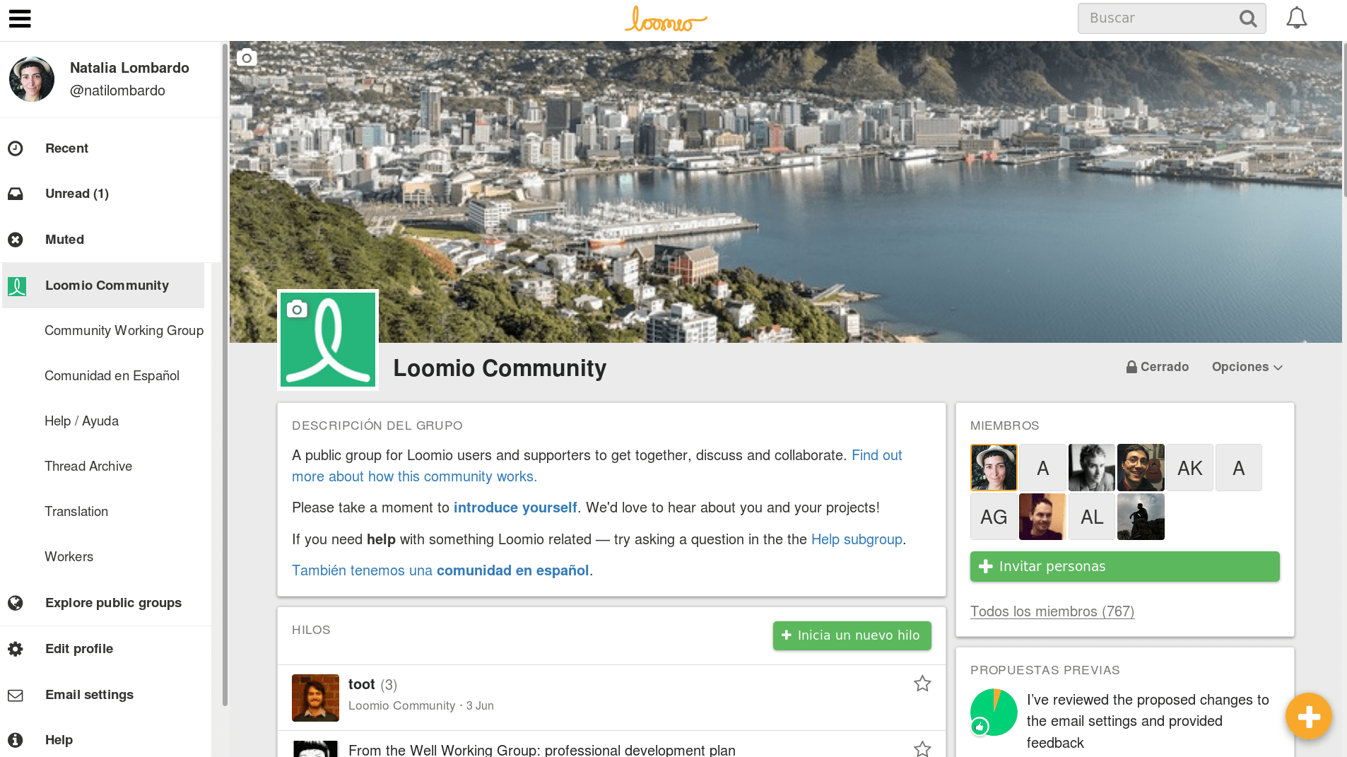
There have been some exciting new UX developments at Loomio HQ! We’ve listened to our user feedback, and added a Loomio sidebar to make the most important parts of the app easier to find.
You’ll notice some changes to the user interface:
- The Recent and Unread options have been moved from the navigation bar at the top of the page to a panel in the sidebar, which also has an additional option so you can see your Muted threads.
- All of your groups are now visible in a list the sidebar.
- Edit profile, Email settings, Help, Contact Loomio and Sign-out are all now listed underneath your groups in the sidebar, instead of being hidden away behind your profile picture in the navigation bar.
- The Explore page, where you can view and ask to join exciting public Loomio groups is now easily accessed via the sidebar!
If you are only a member of one group, you will now arrive at that group immediately after signing in. We hope this makes navigation much simpler for people who’re new to Loomio.
The sidebar is open by default on large screens, and collapsed by default on small screens like smartphones. It can be toggled via the bars icon.

If you have any trouble with the sidebar or anything else Loomio-related, please don’t hesitate to get in touch.
Hannah, on behalf of the Loomio team
Tags: News
